Showing posts with label CSS3. Show all posts

Tuesday, January 26, 2021

Markdown table sorting

Problem

I restarted my crypto trading recently that I put on hold back in 2018. Last time it was mainly revolving around BitCoin, Ethereum, LiteCoin only. But this time it's a new world of DeFi (Decentralized Finance) and its ETH-based coins. When I analyzed I saw that there are a lot of things affecting the price along with the sentiments and real value. I really wanted to have a place where I can list my favorite coins with my favorite properties to analyze. First I thought of creating my Wikipedia page, but I saw it's already there and outdated. I am fine with editing that page but it's locked for editing with my points in the wiki. 
The second option is to start my own crypto page in GitHub as markdown. 

Now the actual problem came. The table on the wiki page is sortable but the markdown table is not by default. The problem can be summarised as 

How to create and publish a markdown page in GitHub pages that have sortable tables 

Approach

I found many approaches but a jQuery based table sorter worked without any complications. Below are the steps to get it integrated into GitHub repo.

How it works

We can attach it to any HTML page. First, make sure jQuery is added to the page. Second, refer to the tablesorter library and its style, etc...Finally, select the tables and attach that to the table sorter.

How to integrate into GitHub pages

The GitHub pages are processed by Jekyll. We can give the Jekyll layout in any GitHub repo by adding _layouts folder. The code is worth a thousand words. Please see the below page for the code reference.

https://github.com/mind-maps/cryptocurrency/blob/main/_layouts/default.html

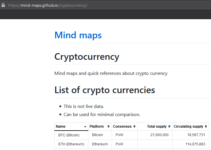
Below is the page in the repo where a sortable table is added.

https://mind-maps.github.io/cryptocurrency/

Solution

After working on the GitHub page for one day, I became lazy and did google again. Finally found the coinmarketcap.com site is providing login experience and can maintain a watch list there with the properties I want to analyze

Reference

https://tympanus.net/codrops/2009/10/03/33-javascript-solutions-for-sorting-tables/

Tuesday, March 28, 2017

My JavaScript Module experiments - CSS

This post is continuation of my JavaScript module experiments series with Webpack. Earlier posts below.

1 My JavaScript Module experiments
2 My JavaScript Module experiments - CI & CD
3 My JavaScript Module experiments - CSS

This post assumes the basic knowledge about NodeJS, NPM, Webpack such as its config file and require mechanism.

Should we bundle css?

It really depends. 

Traditional CSS development

If we take the scenario of simple web site development, we may not need bundling provided entire CSS is in single file. But that is not at all the scenario right now. We need the sites responsive and for that we may have to add dedicated styles for different screen resolutions. One way is to write everything in the same css or separated files loaded on demand. But keeping in different files and downloading all to client and deciding which to use will slow down the performance. Because it needs more http file requests. Keeping in separate files is easy in terms of maintaining. Normally the decision to what style needs to be applied is taken at client side based on the screen size. It will be overhead to request the css for different sizes when the user resize the browser window. So it is better to bundle the css for different sizes at server and download as one file. 

Modern CSS

Modern CSS means writing CSS with the help higher level languages such as LESS or SASS. They help us to write less reusable code and get things done. Since the poor browser cannot understand this LESS or SASS languages, we have to convert to CSS. That process is called transpilation. Here there are chances that some styles will be in pure CSS, some in LESS and some in SASS. As we have to convert to CSS and refer into the application, it is better to bundle the outputs to one css file and refer same.

HTML component

Another scenario is development of web components or on-demand view development. In those scenarios we don't have to keep entire CSS in single place and refer from the beginning. We have to bundle the css along with the JavaScript component which only loaded when needed.

Webpack and CSS

Now lets see how the Webpack and CSS works together. 3 different scenarios are listed below to understand at the simplest level. To keep it simple no other things like ECMA 6 or TypeScript is used.

Simple scenario - webpack and css

Here we are simply going to require .css files from JavaScript to get it available in the html. Below are the steps
  • Import the npm packages named css-loader & style-loader. These are the Webpack specific NPM packages to process .css . The first one is to recognize the .css file and other is to load the .css as <style> tag.
  • Modify the webpack.config.js file to have loader. For syntax refer to the sample given below
  • Add require statements in to the JavaScript file
    • require('./stylesheet.css');
Below is the link to sample.


To run the sample. 
  • Make sure there is NodeJS and NPM
  • Clone the repo to the local machine
  • Open NodeJS command prompt and navigate to the \ECMA-CSS folder
  • run 'npm install' command to download dependencies.
  • run 'webpack' command.
    • If the webpack is not available at system level, '.\node_modules\.bin\webpack' is required
  • This will produce bundle.js file
  • Just run the index.html file from file system. Make sure there are permissions to run JavaScript from local file
When running we can see that there are <style> tags added to the <head> which are not present in index.html file. Those are added by the style loader at runtime.

Combined css

Injecting <style> at runtime is not a good solution. Better is to have a final combined css file. The below sample shows that mechanism using one more npm package called 'extract-text-webpack-plugin'. Since the sample uses webpack 1, the version of 'extract-text-webpack-plugin' should be 1.0.1.


Here the index.html is referring to a style file called bundle.css which is not there in repository. When this sample is run using the same steps mentioned for above previous scenario, the bundle.css will be created by Webpack. Once that file is present, we can run the index.html as usual.

The bundling of multiple css files to one is done by using ExtractTextPlugin configured in webpack.config.js file and here we don't need the style-loader.

CSS & LESS together

This is the next level where we mix plain .css with advanced .less file and finally produce combined .css file. Sample is available in the below location.


In this sample, instead of earlier childstylesheet.css, childstylesheet.LESS is used. The npm packages used are less, and less-loader for compiling .less files and to load the same respectively. The webpack.config.js also modified to tell how to handle the .less files and to combine using ExtractTextPlugin.

During the compilation the .LESS file will be compiled to .css and then combined with other .css file to produce bundle.css file.

Further reading

https://webpack.github.io/docs/stylesheets.html
http://jamesknelson.com/writing-happy-stylesheets-with-webpack/
https://css-tricks.com/css-modules-part-2-getting-started/
http://stackoverflow.com/questions/39015521/import-css-and-js-files-using-webpack
https://github.com/webpack/file-loader/issues/32

Tuesday, August 2, 2016

Made JoymonOnline.in responsive without bootstrap

Background

Now a days 'responsive web site' is not an separate requirement. Whatever site we are developing, it must be responsive. But it was not the case with my personal site www.JoymonOnline.in . It was developed long ago when there were not much mobile users. It still uses ASP.Net using Web Forms and there are my own reasons to do so which is explained in one of previous post.

It was difficult to keep my personal site as desktop only. Whenever the url is shared people immediately open in their mobile and looks like is this really belongs to an Application Architect who blogs about JavaScript, HTML5, AngularJS etc...Soon the decision to 'make JoymonOnline.in responsive' has been taken as one of the 2016 goal.

Analysis

The biggest decision was whether to move to ASP.Net MVC or AngularJS along with this effort. Another factor was whether to use any library or framework for making site responsive such as bootstrap. Now a days most of the app including enterprise apps are using bootstrap to make the site responsive.
Since the earlier experience with third party libraries were not good, the decision was to be brave and do it by knowing what is meant by making a HTML page ersponsive instead of just following Boostrap's guidelines. Another decision factor was this is one of opportunity I will be getting to make site responsive without bootstrap. In my day job, Bootstrap seems the default.

Though we have to do from scratch which may take some time to settle down its worth doing atleast one site responsive without Bootstrap to know the basics. Then its easy to approach Bootstrap.

Responsive site without bootstrap

As everybody knows, the secret is media queries in CSS3. I could get a nice article explaining how to make the site responsive in simple steps without Bootstrap. Just followed that and the site became responsive in 2 days.

http://webdesignerwall.com/tutorials/responsive-design-in-3-steps
http://webdesignerwall.com/tutorials/responsive-design-with-css3-media-queries

Responsive Fonts / Typography

This is still a to do item. Though currently font size is not changing its readable in small devices, There are some good articles in internet which explains how this can be done. Its better to follow modular scale if there is not much design background or we are not sure how to decide the font sizes.

Testing for responsive

There are many sites to validate our site for its performance, code quality etc... But I didn't see much automated sites for testing responsiveness of web sites.

There are some sites which loads our site side by side in different device sizes which helps us to understand how our site looks in devices. But I would recommend the F12 browser tools for testing.

http://responsivedesignchecker.com/joymononline.azurewebsites.net
http://mattkersley.com/responsive/

Let me know if you find any bugs related to responsiveness in my site www.joymononline.in